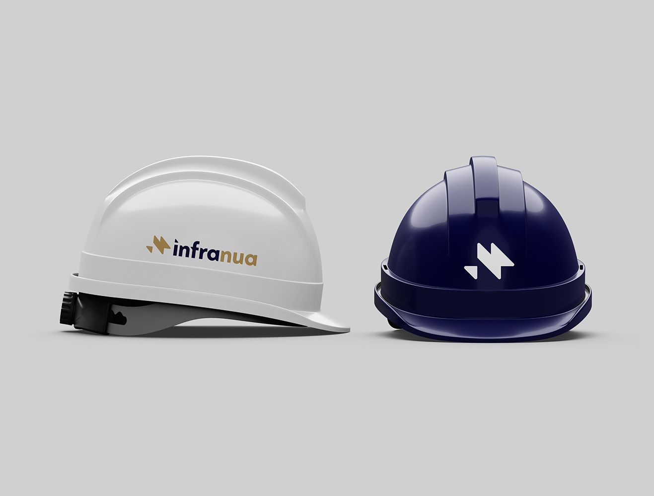
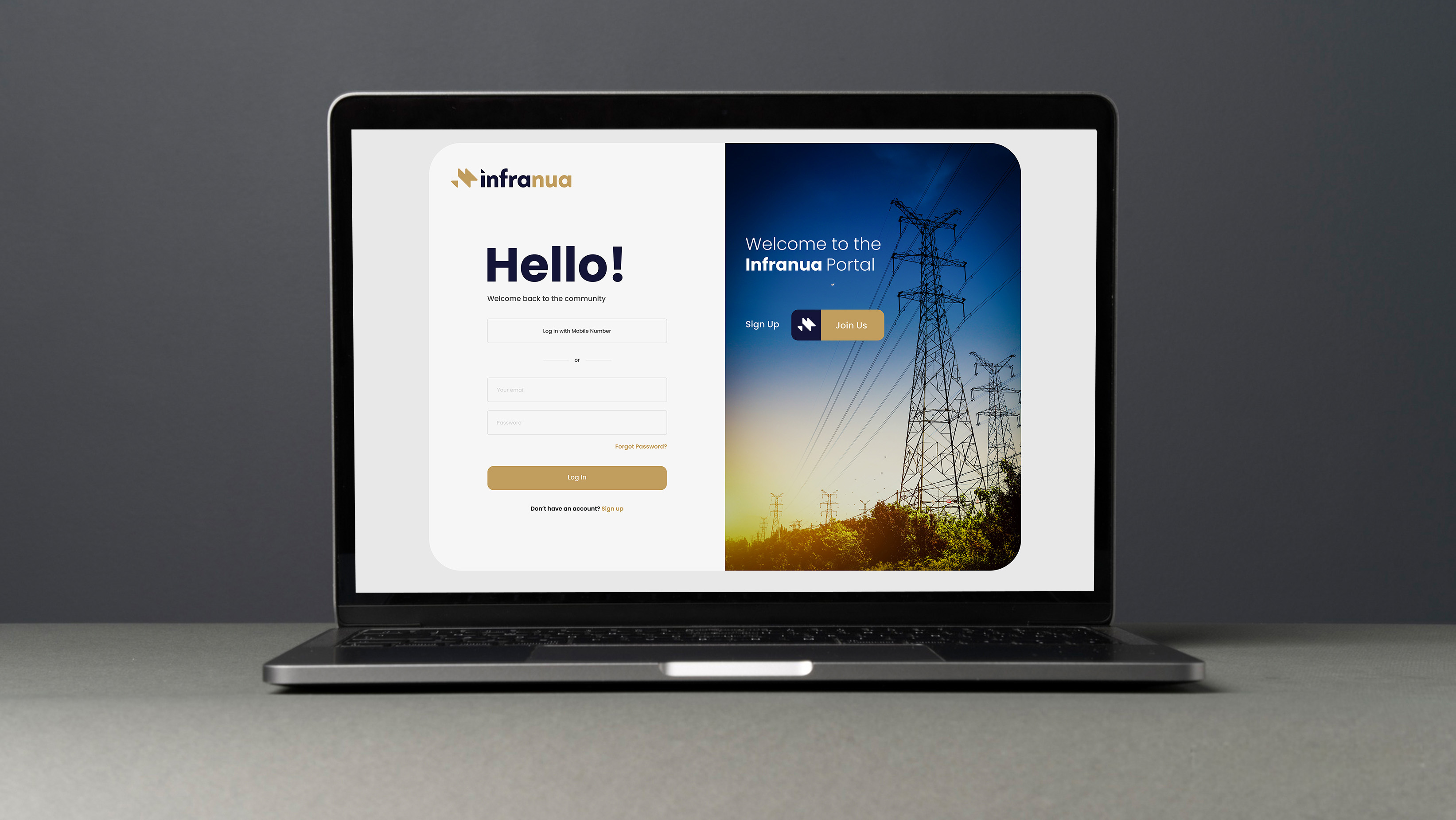
Infranua (formerly Reasire) helps organisations plan and deliver sustainable energy infrastructure. They approached us to lead a complete rebrand, including a new name, logo, website, and supporting marketing materials.The Infranua mark is bright and dynamic, built from a series of interlocking triangles representing assets, area, and infrastructure expanding outward.
Within the form, a subtle spark for the ‘N’ emerges on the right, while an inverted ‘I’ on the left points upward and forward, symbolising continuous monitoring and progress.


